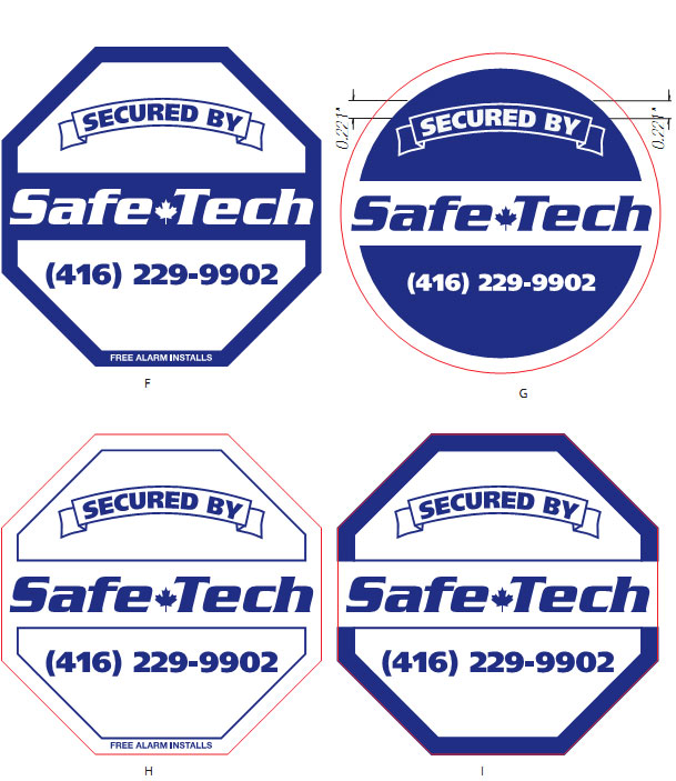
Please vote which signs you like the best

16 replies
  • OFF TOPIC
  • |
Hello all,

I have to choose the best sign for our company and I am not sure which one to go with. I have many opinions but they are so different.

I was hoping that you guys can help me into this decision.


Many thanks in advance

You can select them using the letter underneath FGH or I

Thanks !
  • Profile picture of the author jimbo13
    I like F the best but can't explain why. I'll have a go though.

    I think it looks 'solid' for some reason and you are selling burglar alarms or monitoring I think?

    So that is why. I think the white one looks flimsy so would not tally that with an alarm and security if that makes sense.

    Also the octagonal shape is the same as the STOP sign in the UK, although that is red, so maybe that says STOP to a burglar.

    I don't know if your STOP signs are the same.

    So the 2 together lead me to F

    Dan

    PS: You will now get 3 other comments choosing the other 3
    {{ DiscussionBoard.errors[4130709].message }}
    • Profile picture of the author ThomM
      I like F also (sorry Dan)
      The blue border implys' a fence or barrier.
      I'd try out using reflective lettering for your company name.
      The only thing I don't like about it is the 'fire alarm installs' at the bottom.
      For some reason that cheapens the sign to me and I would still try to break into the house. I'd be aware of an alarm system, but I'd try to beat it.
      Without the 'fire alarm installs' it seems more threatening.
      By the way, I'm not a thief or burglar.
      I had a job once where I sat in an office by myself in a small carpet warehouse. With nothing to do all day, I got into figuring out ways to beat the security system. Now I like to check out the systems in stores and such.

      Dan they are that shape and red here also. The stop signs that is.
      Signature

      Life: Nature's way of keeping meat fresh
      Getting old ain't for sissy's
      As you are I was, as I am you will be
      You can't fix stupid, but you can always out smart it.

      {{ DiscussionBoard.errors[4130920].message }}
      • Profile picture of the author Bill Farnham
        If you google "home security signs" you'll see the 'stop sign' shape is widely used. Especially by ADT who is one of the big ones and also uses a dark blue color.

        Ditch the round shape.

        And I agree with Thom that having 'fire alarm installs' removed is a good idea. It carries all the power of a "Beware of Dog" sign with the word Chiuaua at the bottom.
        Signature
        {{ DiscussionBoard.errors[4130982].message }}
  • Profile picture of the author bravo75
    I thought it was a misspelled "which song do you like best thread." Sorry OP. I concur with ThomM and jimbo13.
    {{ DiscussionBoard.errors[4130948].message }}
  • Profile picture of the author synergyxtr
    The I option looks good
    Signature

    Synergy Extreme. Your extreme virtual assistant provider.

    {{ DiscussionBoard.errors[4130956].message }}
  • Profile picture of the author TEC
    Originally Posted by mike-seo View Post

    Hello all,

    I have to choose the best sign for our company and I am not sure which one to go with. I have many opinions but they are so different.

    I was hoping that you guys can help me into this decision.


    Many thanks in advance

    You can select them using the letter underneath FGH or I

    Thanks !

    I like F...very nice!
    Signature


    {{ DiscussionBoard.errors[4130994].message }}
  • Profile picture of the author thunderbird
    F and I work for me, but I'd agree with ThomM that "Free Alarm Installs" cheapens it (not to mention ain't actually honest).

    (I once sold alarm systems. Going to a trailer park was something else, with huge dogs throwing themselves against link fences as I walked by).
    Signature

    Project HERE.

    {{ DiscussionBoard.errors[4131113].message }}
  • Profile picture of the author tonyalves
    I would choose "F" above the rest. I think it looks really sharp.

    However, I would move the "FREE ALARM INSTALLS" from the border to below the phone number.
    Signature
    Struggling? Can't make anything work? Help is Here!..
    Get this low cost course and start building a business that will earn you a living on autopilot.
    Click here to get it now: Just Updated
    Get It While The Bonuses Are Still Available
    {{ DiscussionBoard.errors[4131177].message }}
  • Profile picture of the author smart_ladoo
    I and F both are good, i would go for I
    {{ DiscussionBoard.errors[4131782].message }}
  • Profile picture of the author astrutz
    I like I the best. F would be ok too, but i would highly recommend not picking G and H.
    {{ DiscussionBoard.errors[4131799].message }}
  • Profile picture of the author Sunfyre7896
    F gets the most attention because of the white letters on the dark background which contrasts not only for that word, but against the other words that are in darker print. It brings the attention to the name, which the other three do not do. Having the name the same color as everything else just makes it blend together. I say go with the first one, F, to be sure. It stands out and that's what you want to see from a logo.
    {{ DiscussionBoard.errors[4132390].message }}
  • Profile picture of the author Roaddog
    Another vote for 'f'...


    And make it red or a semblance of red...it's a 'natural' habit now...for people to stop and read something red.
    {{ DiscussionBoard.errors[4133321].message }}
    • Profile picture of the author mike-seo
      Thank you all for your great suggestion, very important for me.

      Thanks again
      {{ DiscussionBoard.errors[4146467].message }}
  • Profile picture of the author KateHunter
    Definately F! The others all look insecure.
    {{ DiscussionBoard.errors[4147023].message }}
  • Profile picture of the author mike-seo
    Hmm, looks like F is the winner .
    {{ DiscussionBoard.errors[4148912].message }}

Trending Topics