Html, CSS and JavaScript tricks for mobile websites
Hi, I just published this article so thought will share it here. Its quite useful.
As of 2014 mobile users have surpassed desktop users and according to google adwords blog published on May 2015, mobile searches have increased.
Here is what google said
"In fact, more Google searches take place on mobile devices than on computers in 10 countries including the US and Japan."
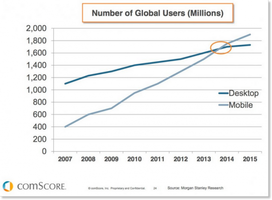
So with the increase in mobile searches, it is safe to assume that at least half of your website traffic is coming from mobile searches including tables (most tablets are categorised as mobile devices).
In fact just to prove that I am right, here is a google analytics screenshot of one of our client website for last month.
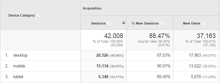
As you can see desktop searches are 20,526 and mobile plus tablet searches are 21,482, which is just edging desktop. This data might be different in another niche but it will be more or less same so now we need to cater for mobiles.
As much as we love mobile apps, not every company has a budget or resources to make a web app.
So what do we do?
We make our websites responsive or create a mobile version so we are not losing any sales.
Here are some tricks/protocols which we can use to make sure we provide the best possible mobile user experience to our customers. At the end there is a list of open source JavaScript libraries which you can use to enhance your websites for mobile.
Continue reading article at Html, CSS and JavaScript tricks for mobile websites
As of 2014 mobile users have surpassed desktop users and according to google adwords blog published on May 2015, mobile searches have increased.
Here is what google said
"In fact, more Google searches take place on mobile devices than on computers in 10 countries including the US and Japan."
So with the increase in mobile searches, it is safe to assume that at least half of your website traffic is coming from mobile searches including tables (most tablets are categorised as mobile devices).
In fact just to prove that I am right, here is a google analytics screenshot of one of our client website for last month.
As you can see desktop searches are 20,526 and mobile plus tablet searches are 21,482, which is just edging desktop. This data might be different in another niche but it will be more or less same so now we need to cater for mobiles.
As much as we love mobile apps, not every company has a budget or resources to make a web app.
So what do we do?
We make our websites responsive or create a mobile version so we are not losing any sales.
Here are some tricks/protocols which we can use to make sure we provide the best possible mobile user experience to our customers. At the end there is a list of open source JavaScript libraries which you can use to enhance your websites for mobile.
Continue reading article at Html, CSS and JavaScript tricks for mobile websites
-
georgeweb13 -
Thanks
{{ DiscussionBoard.errors[10510866].message }} -
-
jasonthewebmaster Banned-
Thanks
{{ DiscussionBoard.errors[10510895].message }} -