13 replies
  • WEB DESIGN
  • |
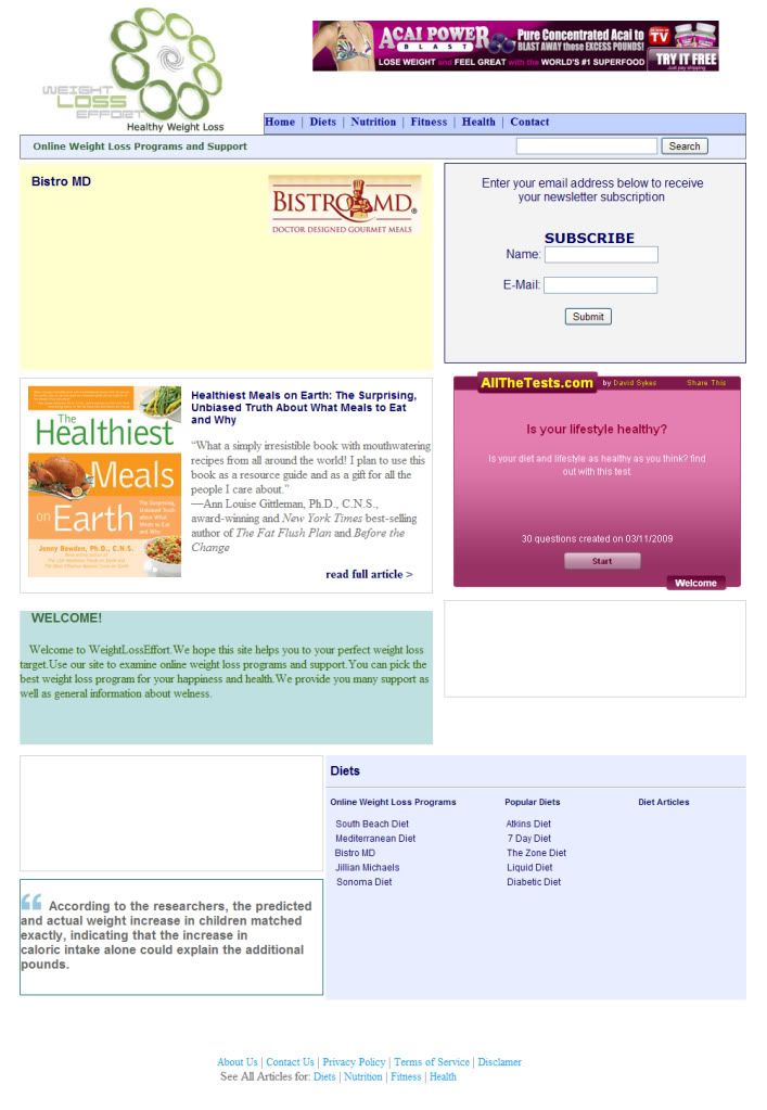
Can you review this layout. I will create a website.
Thanks
#layout
  • Profile picture of the author Intrepreneur
    Colour theory is wrong man.

    Here's a good tut on using good colour theory.

    Beginners Guide to Using the Power of Color in Web Design - Speckyboy Design Magazine

    Other than that the layout is good.
    {{ DiscussionBoard.errors[2129674].message }}
    • Profile picture of the author kevlah
      Everything should be made as simple as possible, but not simpler.
      There is too much on the page. It makes it difficult to focus on anything. I guess your site is trying to sell one particular thing to a visitor. Make that one thing the focus of the layout. You can have other things on the page but they should be as invisible as possible and help your main 'thing' stand out.

      Less is more
      {{ DiscussionBoard.errors[2129920].message }}
  • Profile picture of the author Ana87nbgd
    It's a nice layout but I would recomend some changes. Try not to use the most common font font such as Times New Roman and pick something better looking, for example Arial or Verdana or maybe even some font that is not included in Windows XP (you can find amazing fonts anywhere on internet for free). I also don't like a lot a pink part, it's a little bit annoying to look at. Try picking some lighter color.
    I like the design a lot, it's very well structured, just change some colours and fonts and it will be perfect.
    {{ DiscussionBoard.errors[2130740].message }}
  • Profile picture of the author Lisadeb
    You have used many colors but on the menu bar you have a blue and on the footer another different blue, it's not very beautiful...
    I think it would be better if you keep the same blue and gray colors you have set in the footer.
    {{ DiscussionBoard.errors[2131696].message }}
  • Profile picture of the author alkantenik
    I understood your suggestions about colours.
    What about subscription form? Is it very big?
    Signature
    Wordpress Designer
    Skype: wordpress_alkan
    {{ DiscussionBoard.errors[2131852].message }}
  • Profile picture of the author BMboyz
    err.. i think too many space left empty.
    {{ DiscussionBoard.errors[2131966].message }}
    • Profile picture of the author TheCopyGirl
      I'll do my best to go from top to bottom.

      The location of the banner advert is standard enough. However, it will be nice if it displays an extension of your logo in the top-left, with a tagline or some such. You can fade it out to display the banner, and the banner can fade out to display the extended header, and so on and so forth, for ever. To get the fade-in/fade-out effect, you could use jquery as shown in the tutorial here.

      Please pay more attention to the navigation. It is one of the most crucial aspects of your website. You can find some really good examples of jquery navigation here.

      In the main body, as has been pointed out, the layout doesn't emphatically/clearly convey what the website is about. Is it a news/magazine like site that collects and displays articles? Is it a personal blog? If you want people to opt-in, and this is your idea of a landing page for your subscription box, then it's badly done because the subscription page is overshadowed by all the other stuff on the page. I'm not sure what the box in pink is supposed to be - a page on your own site, or an advert? Consider a narrower sidebar if these aren't your main focus.

      I'd like the "Welcome to..." text to be the first thing that hits me. I don't want to be looking/scrolling for it. But again, this is just me

      You have an overwhelming footer. Consider the footer area in the layout here (scroll all the way to the end - and check out some of the other templates at this site too, for this kind of a footer-area), and try to mimic it for achieving the same effect but with greater style.

      I agree with the comment about the color scheme, it looks a bit patchy/pieced-together, and a more coherent/co-ordinated look would be more appealing.

      Of course, much of the above was subjective, and no offense intended! You have a nice start, keep at it. Good luck!
      {{ DiscussionBoard.errors[2132064].message }}
  • Profile picture of the author alkantenik
    Great informations my friend. Your links are very usefull. I will consider this suggestions.
    Thanks.
    Signature
    Wordpress Designer
    Skype: wordpress_alkan
    {{ DiscussionBoard.errors[2132333].message }}
    • Profile picture of the author TheCopyGirl
      Most welcome! Glad you found them useful, and all the best
      {{ DiscussionBoard.errors[2132350].message }}
  • Each of those boxes look like advertisements, because none of them look consistent with the design of the website, also the bottom 2 boxes, just don't fit (in size) with the others.

    The link in your signature looks better than that design. in my opinion.
    {{ DiscussionBoard.errors[2138536].message }}
  • Profile picture of the author ab420
    It just looks completely random - it reminds me of a corkboard where people tack up ads all over the place.
    {{ DiscussionBoard.errors[2139098].message }}
  • Profile picture of the author carolwingert
    I agree with ab420. And it doesn't look organized.

    The opt in box, Why not say "Sign up for our free newsletter here!"

    Just a few thoughts.
    Signature

    Carol Wingert
    http://www.carolwingert.com
    http://www.iPhotographGod.com - Seeing the Divine in Everything!
    https://www.createspace.com/3453951 - 27 Pennsylvania Edible Plants - Full Color!

    {{ DiscussionBoard.errors[2139141].message }}
  • Profile picture of the author alkantenik
    Thanks my friends.
    I want to show to you my subpage. My subpages is www.weightlosseffort.com/test
    Please look at that. Is this page should be my index page. What do you think?
    Signature
    Wordpress Designer
    Skype: wordpress_alkan
    {{ DiscussionBoard.errors[2140279].message }}

Trending Topics