Bing Just Officially Rebranded As 'Microsoft Bing' and There's Even a New Logo
A new article on Search Engine Journal says that Bing has officially rebranded as 'Microsoft Bing' and we've got new color schemes, and even a fresh logo to look at.

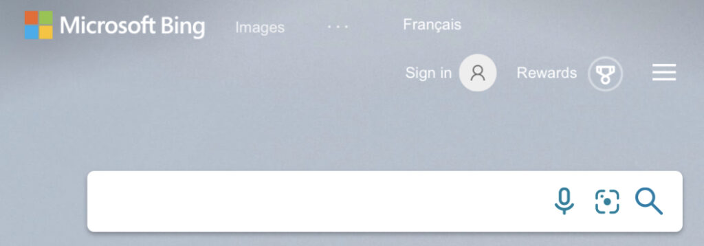
Take a look at the updated Bing.com homepage. That, somewhat interestingly perhaps, features the Microsoft logo rather than the new Bing logo:
The rollout of changes here could be viewed as a little confusing. Old logos still appear here and there online, but what do people think of the new logo? Is it better? Is it worse? Does it look softer or harder? Here it is in context:

Microsoft had this to say about the move:
As Microsoft itself said, many of its products are powered by Bing - so, maybe adding the parent-company name to Bing branding makes perfect sense. However, some out there feel that it would have made more sense to just rebrand the whole thing as 'Microsoft Search.' After all, we've already seen the advent of 'Microsoft Ads' (which happened last year) - That was of course formerly known as Bing Ads. Yet, Microsoft is seemingly reluctant to retire the Bing name - at least for the time being. What do people think? Is this a bit of a mish-mash in terms of branding?
Take a look at the updated Bing.com homepage. That, somewhat interestingly perhaps, features the Microsoft logo rather than the new Bing logo:
The rollout of changes here could be viewed as a little confusing. Old logos still appear here and there online, but what do people think of the new logo? Is it better? Is it worse? Does it look softer or harder? Here it is in context:
Microsoft had this to say about the move:
| "That's why starting today, you will see a shift in product to Microsoft Bing, which reflects the continued integration of our search experiences across the Microsoft family." |
---> [URGENT] Here's How To Build Wealth With Gold And
Silver And Earn Up To $7,000 Per Week!