Weird eBook Formatting Comment - Kindle, PDF, and printed

9 replies
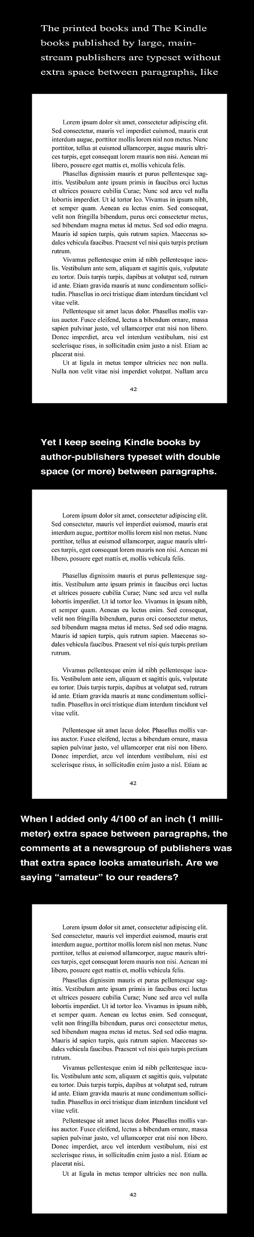
The printed books and the Kindle books published by large, main-stream publishers are typeset without extra space between paragraphs.

Yet I keep seeing Kindle books by author-publishers typeset with double space (or more) between paragraphs like we do in our emails and forum posts.

Besides being here at the warriorforum, I also haunt a newsgroup of independent publishers. Some of these folks publish dozens of books written by many different authors, and I asked their opinions.

When I add only 4/100 of an inch (1 millimeter) extra space between paragraphs, doing so seems to make the layout easier to read, but the comments at the newsgroup of publishers say that extra space looks amateurish.

Are we saying "amateur" to readers of our ebooks, Kindle books, and the printed books we create?

:-Don

#book #comment #formatting #weird
  • Profile picture of the author edlewis
    Blah...

    I pay very little attention to what that crowd has to say - just being honest. (And vice versa, I am sure.)

    My opinion is all that stuff is just a way to try and put up roadblocks for the "little guy" to start self-publishing.

    The only person who matters is the reader.

    Does your reader know this is "amateur"?

    Does he care?

    That is all that matters. The problem with that crowd is they seem to write more for other writers and care how it makes them look to other writers - when the focus should be on the reader.

    Personally, I like more white space and less big WALLS of text.

    But I'm a weirdo...

    When you get into this world of publishing/self-publishing you find that there are a lot of "rules". Personally, I feel it's best to ignore them.
    {{ DiscussionBoard.errors[8478523].message }}
  • Profile picture of the author Lambert Klein
    Usually fiction is spaced like your first sample.

    Non fiction is usually spaced like your second sample except the first line isn't indented (block paragraphs).

    For Kindle ( non fiction ) you shouldn't hit return twice. Instead set the paragraph settings to increase the spacing between paragraphs. This way you hit the return key once and it will give the appearance of your second sample.

    I think the paragraph spacing is easier to read especially for non fiction. The tradition for fiction is like your first sample though.
    Signature

    WordPress Domination: from Beginner to Ninja in 7 Days http://www.amazon.com/dp/B007LS0TLE

    {{ DiscussionBoard.errors[8478532].message }}
  • Profile picture of the author JohnMcCabe
    Don, one of the reasons for not adding extra space in printed books is the price of paper. Adding .04"/line x 1000 lines means an extra 40" of paper required, which costs money.

    I doubt the average reader takes leading (the space between lines and paragraphs, for those unfamiliar with the term) into account unless it makes the page harder to read.

    What the folks in your newsgroup seem to be saying is that anyone who does things differently than they do is "amateurish". I worry more about the opinions backed by credit cards than those added to shop talk.
    {{ DiscussionBoard.errors[8478752].message }}
  • Profile picture of the author Don Schenk
    Thank you all. I usually march to the beat of my own drummer, and have been using example #3 with the 1 mm (and sometimes 2 or 3 mm) added spacing. I was just surprised by the reaction of the other publishers. And I wanted to bounce this off some warriors.

    And I just sent a new book off to Lightening Source, Inc for the printed version, and used the 1mm paragraph spacing.

    @Lambert Yes, I've been using the paragraph setting to set space between paragraphs - for Kindle and for printed books.

    @Ed I always use an extra line of spacing on all my forum post so people won't need to look at a solid block of type. And I have been using some added leading between paragraphs in all my writing because of this.

    @John When others started talking about the "rules" I was reminded of the Zig Ziglar story about cutting off the ends of the roast before cooking it.

    :-Don
    {{ DiscussionBoard.errors[8479075].message }}
  • Profile picture of the author jbsmith
    Now I know why I rarely read fiction...it's the spacing!
    {{ DiscussionBoard.errors[8479654].message }}
    • Profile picture of the author marciayudkin
      Don,

      There are some mainstream business publishers that have put out books in the block letter style, that is, with double spacing between paragraphs. Note, however, that that style does not also include paragraph indenting. If you indent paragraphs AND double space between paragraphs, you are definitely marking yourself as an amateur in the eyes of people who look at the written word for a living. Smashwords rejects your ebook if you make this particular goof. (No big deal, you can just reformat it and get it accepted.)

      One reason traditional publishers spurn the block letter style for books is that when a paragraph happens to end at the end of a page, and goes all the way to the right margin, there is no way to signal that the paragraph that follows on the next page is actually a separate paragraph rather than the continuation of the previous paragraph. It is a very clutzy looking style in this and other ways.

      Whether you want to pay any attention to such comments has to do with your audience. There are so many dead giveaways of amateurism to people in the book business (which includes reviewers and those who order for bookstores) that they can usually correctly tell in 10 seconds whether a book was produced by someone without knowledge of publishing traditions.

      Marcia Yudkin
      Signature
      Check out Marcia Yudkin's No-Hype Marketing Academy for courses on copywriting, publicity, infomarketing, marketing plans, naming, and branding - not to mention the popular "Marketing for Introverts" course.
      {{ DiscussionBoard.errors[8479778].message }}
      • Profile picture of the author Steve B
        Don,

        Just a personal preference - I like having paragraphs separated by a space even if it's "unprofessional."

        Like many folks, "white space is my friend."

        There may be a practical reason for this. Lots of us that work online for extended periods resort to skimming content. I find I do this when I read the printed newspaper.

        Having a space separating paragraphs (or blocks of text) seems to make that practice easier. Maybe the eye is directed to skim from "block to block" by automatically being conditioned to search out the white spaces.

        Just a thought.

        Steve
        Signature

        Steve Browne, online business strategies, tips, guidance, and resources
        SteveBrowneDirect

        {{ DiscussionBoard.errors[8479814].message }}
  • Profile picture of the author Don Schenk
    Thanks Marcia,

    What initiated this was I typeset a page from the book (rather than lorem ipsum) with no spacing between paragraphs, and the 1 mm spacing. I then showed it to people and ask which one the found easier to read.

    Everyone I spoke with liked the tiny spacing, so I went with it for the printed book, printed by LSI. I may tighten it for Createspace. Especially if the loose spacing will be a no-go for reviewers.

    :-Don
    {{ DiscussionBoard.errors[8480592].message }}

Trending Topics