 8th Sep 2012, 09:13 PM
| #1 |
| The Cave Man War Room Member  Join Date: 2010
Posts: 334
Thanks: 59
Thanked 96 Times in 79 Posts
|  jQuery Mobile With Themeroller
Share on:
    1.) Go to ThemeRoller | jQuery Mobile 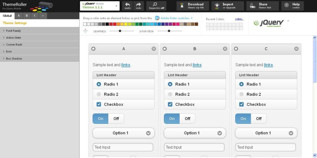 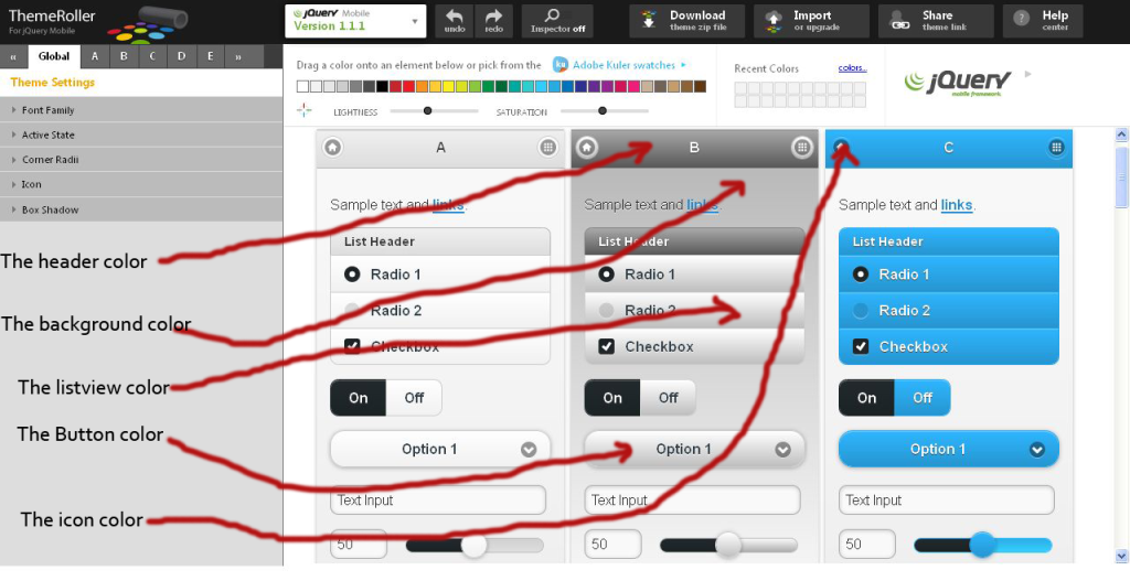 This is the color combination that I’ve done for A,B, and C. I’ve retain the color of A just the B and C . You can design color combination as many as you like From A to Z. Now if you’re happy with the color combination you will go on to download the zip file. 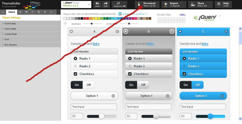 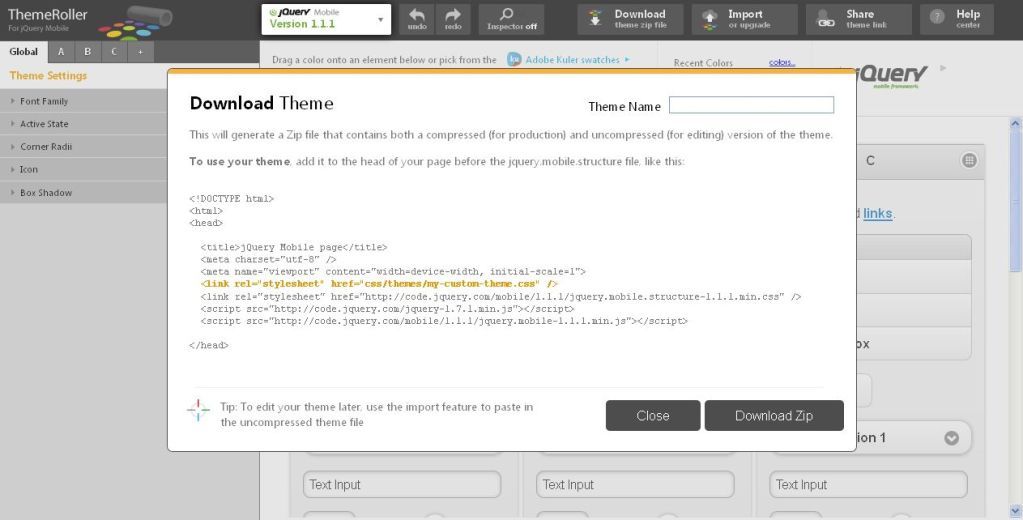 In the Theme Name you can write whatever name you want like “customtheme”, “style”, “shinyhead”, its up to you and then Download Zip. This will be the script in the head of your index.html <!DOCTYPE html> <html> <head> <title>jQuery Mobile page</title> <meta charset="utf-8" /> <meta name="viewport" content="width=device-width, initial-scale=1"> <link rel="stylesheet" href="css/themes/my-custom-theme.css" /> <link rel="stylesheet" href="http://code.jquery.com/mobile/1.1.1/jquery.mobile.structure-1.1.1.min.css" /> <script src="http://code.jquery.com/jquery-1.7.1.min.js"></script> <script src="http://code.jquery.com/mobile/1.1.1/jquery.mobile-1.1.1.min.js"></script> </head> Change the red mark my-custom-theme.css to your theme name like shinyhead.css This is the jQuery tag: <div data-role="header"> <div data-role="content"> <div data-role="footer"> Example: 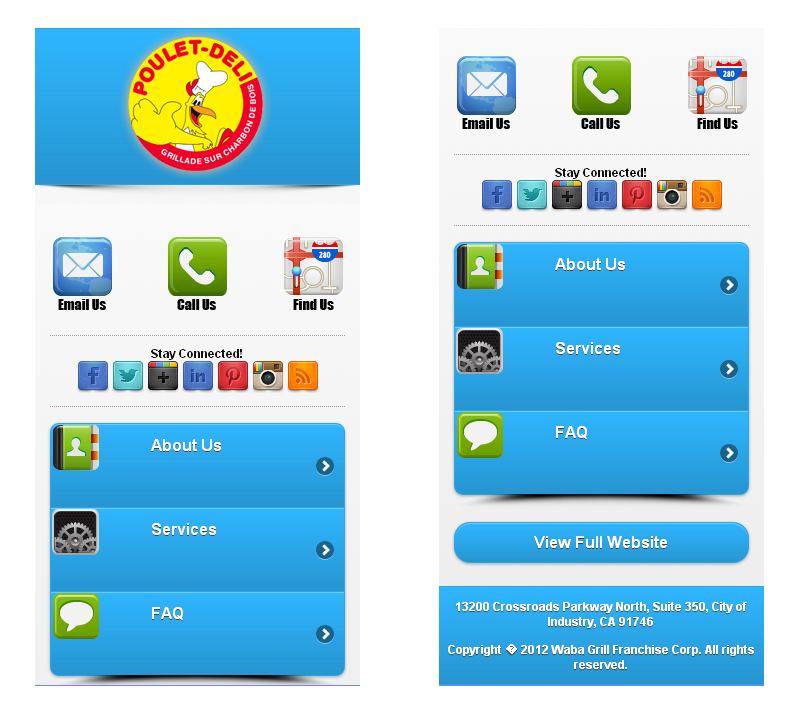 Here is the code in the index.html <!DOCTYPE html> <html> <head> <title>jQuery Mobile page</title>/*Change The Title Name*/ <meta charset="utf-8" /> <meta name="viewport" content="width=device-width, initial-scale=1"> <link rel="stylesheet" href="css/themes/customtheme.css" /> /*Change the red mark to your theme name*/ <link rel="stylesheet" href="http://code.jquery.com/mobile/1.1.1/jquery.mobile.structure-1.1.1.min.css" /> <script src="http://code.jquery.com/jquery-1.7.1.min.js"></script> <script src="http://code.jquery.com/mobile/1.1.1/jquery.mobile-1.1.1.min.js"></script> </head> <!-- header --> <div data-role="header" data-theme="c" style="margin-bottom:0px">/*”data-theme=”c” is the color of the header in the themeroller that I’ve styled*/ <center><img border="0" src="../images/logo.png" alt="Logo"/></center>/*This is the logo in the header, this is also styled in the css file*/ </div> <div class="shadowbox"><img src="images/shadow.png" class="shadow" alt="shadow"></div> /*This is the shadow effect at the bottom of the header*/ <!--/header --> <div data-role="content" data-theme="c"> /*data-theme=”c”This is the color of the background of the mobile website, by the way you can you can change the letter to whatever letter you want as long as you made a color combination of it in the themeroller*/ <!-- call to action --> <p class="calltoaction"> <a href="contact-us.php" rel="external" class="ui-link-inherit"><img src="images/emailus.png" alt="Email" align="left"></a> <a href="tel:#"><img src="images/call_us.png" alt="Call" align="center"></a> <a href="location.html" rel="external"><img src="images/findus.png" alt="Location" align="right"></a> /*This is where the 3 icons located, rel="external" so that the link would work*/ </p> <!-- /call to action --> <!-- social icons --> <p class="social"> Stay Connected!<br /> <a href="#"><img src="images/facebook.png" alt="Facebook"></a> <a href="#"><img src="images/twitter.png" alt="Twitter"></a> <a href="#"><img src="images/googleplus.png" alt="GooglePlus"></a> <a href="#"><img src="images/linkedin.png" alt="Linked In"></a> <a href="#"><img src="images/pinterest.png" alt="Pinterest"></a> <a href="#"><img src="images/instagram.png" alt="Instagram"></a> <a href="#"><img src="images/rss.png" alt="RSS"></a> </p> <!-- /social icons --> /*Where the social icons located just put the link inside the"#"*/ <!-- navigation --> <ul data-role="listview" data-split-icon="right-arrow" data-inset="true" data-theme="c" style="margin-bottom:0px"> /*The "listview" is the menu button, data-inset="true" is the styling with rounded corners but if you want to remove data-inset="true" the buttons will be 100% wide and it is rectangle, data-theme="c" is the color of the listview you can put whatever letter you want that you’ve done in the themeroller.*/ <li> <a href="about.html" rel="external"> <img src="images/aboutus.png" />About Us</a> </li> <li> <a href="services.html" rel="external"> <img src="images/services.png" />Services</a> </li> <li> <a href="./faq.html" rel="external"> <img src="images/faq.png" />FAQ</a> </li> </ul> <div class="shadowbox"><img src="images/shadow2.png" class="shadow" alt="shadow"></div> /*This is the shadow at the bottom of the listview*/ <!-- /navigation --> <a href="index.html" data-role="button" data-theme="c">View Full Website</a> </div><!-- /content --> /*This is the View Full Website button, and it styled in data-theme="c" <!-- footer --> <div data-role="footer" data-theme="c"> /*The footer is styled in letter C*/ <p class="address">13200 Crossroads Parkway North, Suite 350, City of Industry, CA 91746</a></p> <p class="copyright">Copyright © 2012 <b>Waba Grill Franchise Corp.</b> All rights reserved.</a></p> <!-- /footer --> </div><!-- /page --> </body> </html> You can see the Documentation here: jQuery Mobile: Demos and Documentation To know more about:
If you like this post say Thank You. |
| Hooked To Success -Personal development For People Who Wants Success.
| |

|
| The Following User Says Thank You to JagSEO For This Useful Post: |
 |
| Bookmarks |
| Tags |
| jquery, mobile, themeroller |
| |


