 29th Jan 2018, 12:59 PM
| #1 | |
| MMO | Landing Page Expert Join Date: 2014 Location: Bahrain
Posts: 122
Thanks: 52
Thanked 20 Times in 18 Posts
Blog Entries: 1 | How I was able to get a conversion rate of almost 60%+
Share on:
   
Hey WF! I want to share with you how I was able to achieve a fairly decent percentage of conversion rates. Keep in mind that this is done through a continuous process of trial and error. There are 2 main types of tests that I carry out: - A/B Split Testing This is a form of split testing. It is carried out when 2 landing pages (page A and B) that offer the same product/service are set up to see which one gets more optins (subscribers). They are both sent equal amounts of traffic usually from the same source. After some time, the page with the most conversion rates is declared the winner and kept up permanently. This is an ongoing process to further enhance your page by time! - Multivariate split testing This is the same as the previous testing technique, but instead of A/B, you have A/B/C/D/E/etc testing. This is typically advanced and requires you to have a good experience. These tests can be performed on any elements of your page. Here’s a screenshot of me carrying out a split test for one of my landing pages: 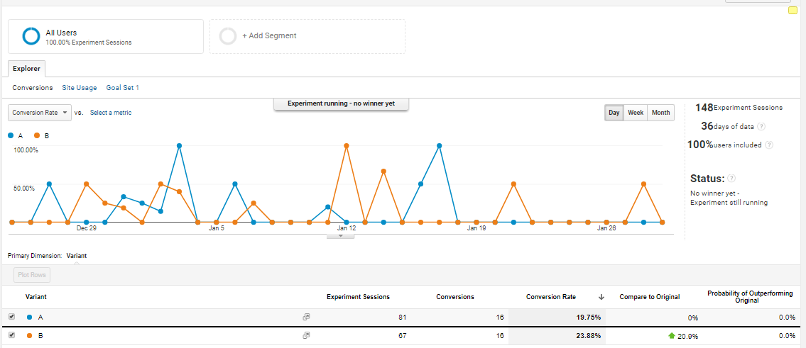 Basically, there are 4 steps of carrying out a successful landing page test: 1. Ask a question - How can I further improve my landing page? What element can I edit? Shall I remove so and so element? etc… 2. Form a hypothesis - Test one thing at a time in order to keep track. 3. Execute a test and determine a winner - Your test should already be running long enough to achieve statistical significance. 4. Rinse and repeat - with another element. The more you do it, the more leads you will get! As a general rule, a good landing page should: - Be easy to follow - Be mobile friendly - Have a clean design. Furthermore, here are a few pointers for what elements it's recommended to test on, along with how to get the most out of them. 1) Landing Page Headlines: - Every landing page should have an engaging headline. - Headlines are the first thing your visitors see, so this plays one of the major roles in 'make it or break it'. - You have around 3 seconds to catch your visitors' attention before they decide whether to stay or not. - If your heading is too long, split it up into a subheading. - Use metrics in your headlines to intrigue visitors. This can be the number of customers that purchased your product, ROI made in a specific time frame, or any sort of metrics! - Use counter-intuitive statements to get more visitors. These kinds of claims tend to challenge the visitors' perceptions, hence promoting them to think something like "Oh really? Tell me more!" - Here's an example of a really good counter-intuitive statement that I use in one of my squeeze pages: "FREE Report Reveals... TOP 6 DIRT CHEAP TOOLS I USE FOR EMAIL MARKETING (Hint: These tools raked in 100 subscribers in just 5 days!)". Good email marketing tools are usually expensive. So I'm offering a list of the tools that I personally use, that are dirt cheap, and have got me 100 subscribers in just 5 days! Like WOW! Your headline should be able to answer the following 3 questions: - “What's the landing page offering here?” Your headline should state clearly what is being offered. A bad example of a headline that I've literally seen is:
Your visitors need to know what exactly it is that you are offering. - “Why does my audience need my offering?” You need to be clear about the benefits and advantages they will receive. Once they acknowledge your offering of its usefulness, you will see more conversion rates. - “Why is this the only place they can get it?” Try to be as unique as possible. If your offering is not unique, add another offer to it! Give your audience a taste of what to expect from you. 2) Landing Page Images: Make sure to use high quality images on your pages. It is recommended to have images of people, preferably smiling, and looking or pointing towards the optin box. Images also include: - Logos - Graphics - Icons - Photos - Arrows - etc... 3) Call-to-Actions: - You button copy is your final chance to encourage people to take action! - Make sure your CTA buttons are always above the fold of your page. - Your CTA should make your visitors realize the value they are going to get when they click on that very button. Text like "Download Now" is too overrated. On the other hand, text like "Give Me the Programming Course!" has a much better chance of getting higher conversion rates. - Experiment with different texts, size, shapes, and colors. - Try to use the first-person point of view in your CTAs. Sentences like "Give Me Access Now!" do quite well as compared to "Get Access Now!" 4) Guarantees - It's a way of telling your visitors that you've got their back. - Guarantees don't always mean refunds, it can also mean replacement of the product or some kind of a service that satisfies the customer. - It can be as simple as saying that you respect their privacy. My Final Suggestions: - Your landing page design should be consistent from A - Z. - Always use clear language. - Always contain valuable offers. - Use fewer color. 3 Colors maximum (Dark - medium - light). - Use no more than 2 different fonts and 3 different sizes. I hope this provided you some good value. Feel free to hit me up if you have questions. Sultan | |

|  |
| The Following User Says Thank You to Mr Sultan For This Useful Post: |
|
29th Jan 2018, 07:20 PM
| #2 |
| Active Warrior Join Date: 2018
Posts: 96
Thanks: 1
Thanked 18 Times in 18 Posts
| Re: How I was able to get a conversion rate of almost 60%+
Share on:
Thanks for your inf. I will try doing what you propose to boost the conversion rate optimization.
|
|
| |
| The Following User Says Thank You to Killua7 For This Useful Post: |
|
30th Jan 2018, 05:44 AM
| #3 | |
| MMO | Landing Page Expert Join Date: 2014 Location: Bahrain
Posts: 122
Thanks: 52
Thanked 20 Times in 18 Posts
Blog Entries: 1 | Re: How I was able to get a conversion rate of almost 60%+
Share on:
 | |
|
| |
|
30th Jan 2018, 06:27 PM
| #4 |
| Active Warrior Join Date: 2011
Posts: 66
Thanks: 1
Thanked 13 Times in 12 Posts
| RE: How I was able to get a conversion rate of almost 60%+
Share on:
Thank you for the excellent guide. I well done on getting that high a conversion rate, you know what you're doing for sure.
|
| | |
|
| |
| The Following User Says Thank You to dmrson For This Useful Post: |
|
31st Jan 2018, 01:19 AM
| #5 |
| Warrior Member Join Date: 2018
Posts: 1
Thanks: 0
Thanked 0 Times in 0 Posts
| RE: How I was able to get a conversion rate of almost 60%+
Share on:
What kind of traffic did you use?
|
|
| |
|
31st Jan 2018, 02:19 AM
| #6 |
| Administrator War Room Member Join Date: 2014
Posts: 319
Thanks: 318
Thanked 334 Times in 191 Posts
| RE: How I was able to get a conversion rate of almost 60%+
Share on:
Great post! If you can, can you tell us some of these things. 1. What was your most successful A/B test and where did you get the inspiration for it? 2. What was your most surprising A/B test result? |
| | |
|
| |
| The Following User Says Thank You to pauloadaoag For This Useful Post: |
|
31st Jan 2018, 11:34 AM
| #7 |
| Active Warrior Join Date: 2017 Location: London
Posts: 90
Thanks: 31
Thanked 40 Times in 34 Posts
| RE: How I was able to get a conversion rate of almost 60%+
Share on:
Very interesting read! Thanks for the info :)
|
|
| |
| The Following User Says Thank You to TonyRoberts For This Useful Post: |
|
1st Feb 2018, 02:21 AM
| #9 | |
| MMO | Landing Page Expert Join Date: 2014 Location: Bahrain
Posts: 122
Thanks: 52
Thanked 20 Times in 18 Posts
Blog Entries: 1 | Re: How I was able to get a conversion rate of almost 60%+
Share on:
1) The test that had the most impact for me, are the headlines. I was working on CRO for one of my tech niche squeeze pages, and I noticed that when I included the terms "list of tools" in my headlines, I actually got a higher conversion rate (around 15%). So I came to the conclusion that you are better off having a lead magnet of a 1 page resource list, rather than a 10 page ebook. 2) I had a squeeze page with my picture on it. Nothing special, just a serious facial expression. When I changed it to a picture of me smiling (showing my teeth), I saw a conversion rate increment of 20%! That was something new to me, and very surprising indeed  | |
|
| |
| The Following User Says Thank You to Mr Sultan For This Useful Post: |
|
1st Feb 2018, 02:28 AM
| #10 | |
| MMO | Landing Page Expert Join Date: 2014 Location: Bahrain
Posts: 122
Thanks: 52
Thanked 20 Times in 18 Posts
Blog Entries: 1 | Re: How I was able to get a conversion rate of almost 60%+
Share on:
| |
|
| |
|
2nd Feb 2018, 02:06 AM
| #12 |
| New Warrior Member Join Date: 2015
Posts: 15
Thanks: 30
Thanked 3 Times in 3 Posts
| RE: How I was able to get a conversion rate of almost 60%+
Share on:
How long did you run your A/B tests?
|
|
| |
|
2nd Feb 2018, 03:45 AM
| #13 |
| Warrior Member Join Date: 2011
Posts: 20
Thanks: 4
Thanked 2 Times in 2 Posts
| RE: How I was able to get a conversion rate of almost 60%+
Share on:
Thanks. Great post. What about putting bonuses? and also testimonial? Will it works well? I mean something like this http://sethyang.com/my-7-figure-nest-egg-leo/ I remake this landing pages a few times. The first version I just have the headlines and email form The second version I put free bonus The third version I put the product owner introduction and also testimonial The fourth version which is now remove the product owner introduction and leave everything as what you can see in the page. What do you think about this? Should I remove the free bonus since you did not mention about it. |
| | |
|
| |
| The Following User Says Thank You to shally87 For This Useful Post: |
|
2nd Feb 2018, 03:46 AM
| #14 |
| Warrior Member Join Date: 2011
Posts: 20
Thanks: 4
Thanked 2 Times in 2 Posts
| RE: How I was able to get a conversion rate of almost 60%+
Share on:
Also. where do you advertise?
|
| | |
|
| |
|
2nd Feb 2018, 06:31 AM
| #15 | ||
| MMO | Landing Page Expert Join Date: 2014 Location: Bahrain
Posts: 122
Thanks: 52
Thanked 20 Times in 18 Posts
Blog Entries: 1 | Re: How I was able to get a conversion rate of almost 60%+
Share on:
According to Investopedia:
Hit me up if you have any questions! Thanks. | ||
|
| |
|
2nd Feb 2018, 06:33 AM
| #16 | |
| MMO | Landing Page Expert Join Date: 2014 Location: Bahrain
Posts: 122
Thanks: 52
Thanked 20 Times in 18 Posts
Blog Entries: 1 | Re: How I was able to get a conversion rate of almost 60%+
Share on:
As for bonuses, testimonials, etc... it depends on what kind of a landing page it is. For example, if it's a sales page, it is wise to put up testimonials. But if it's a basic squeeze page, you might not need them. Notice I said "might not". This is because what works for me won't necessarily work for you. It varies from industry to industry. You just have to see what works for you. It also depends on how well your audience knows you. For example, if you are well known in your respective field, your audience will blindly sign up without having to go through your entire page. On the other hand, if your audience doesn't know you too well, they will need a little more convincing to have them take out their credit cards for you. So keeping all these factors in mind, perform your A/B tests accordingly. You can also send me a message now if you like, and I will be glad to help you out. I might have a few ideas for your webpage. Lastly, I don't really use paid advertising, especially when starting out. I actually get subscribers from different places such as social media, forums, offline, etc... Hope I helped! Hit me up! | |
|
| |
|
5th Feb 2018, 06:59 AM
| #17 |
| Warrior Member Join Date: 2011
Posts: 20
Thanks: 4
Thanked 2 Times in 2 Posts
| RE: How I was able to get a conversion rate of almost 60%+
Share on:
Thanks for the offer OP. I can't PM you due to my member level. I will contact you if I require your help soon.
|
| | |
|
| |
|
11th Feb 2018, 07:22 AM
| #18 |
| Warrior Member Join Date: 2018
Posts: 7
Thanks: 5
Thanked 1 Time in 1 Post
| Re: How I was able to get a conversion rate of almost 60%+
Share on:
I was confused about landing page finally I got the best answers here. nice sharing
|
|
| |
|
9th Aug 2018, 11:40 PM
| #19 |
| Active Warrior Join Date: 2018
Posts: 61
Thanks: 0
Thanked 6 Times in 3 Posts
| RE: How I was able to get a conversion rate of almost 60%+
Share on:
This is really a great information with good explanation. It is really useful for me and others also.
|
|
| |
| Bookmarks |
| Tags |
| 60%, conversion, rate |
| |


