Critique this adsense layout please

by paulgl
16 replies
  • SEO
  • |
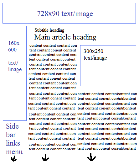
The other day I was experimenting with a new
layout. I changed one page and the CTR went
through the roof. It scared me, so I took it down.
Decided to give it another go and see what
happens. Same thing. CTR through the roof.
All 3 adblocks are visible above the fold, and I
made them all text/image. (I had experimented
with text/image before and it was abysmal)
I used text/image so the page would not be
filled with all these text ads. I also used the
300x250 instead of the larger as smaller ads
looked better.


Anyone care to comment? Good? Bad? Ugly?

Paul
#adsense #critique #layout
  • Profile picture of the author 36burrows
    If the whole purpose is to get ad clicks and it's working, who cares if its ugly!
    {{ DiscussionBoard.errors[4041433].message }}
  • Profile picture of the author IM Ash
    Originally Posted by paulgl View Post

    T
    Anyone care to comment? Good? Bad? Ugly?

    Paul
    Hey Paul

    Who cares if it is good, bad or ugly. I am also someone who spends alot of time ensuring my sites are appealing to the eye. But ultimately we in this to make money. As long as your content is good and you are abiding to the adsense TOS then the rest isn't all that important.

    I say you are a businessman at the end of the day and if your bottom line is seeing positive growth then stick with the layout.

    Just one question... I might try this layout on one of my sites that isn't performing. Is the first banner ad inside the header, below the website name?

    Thanks!
    {{ DiscussionBoard.errors[4041437].message }}
    • Profile picture of the author paulgl
      Ah yes! Forgot! Image updated.

      The header image is actually 760 pixels wide,
      as is the table below it.


      Paul
      Signature

      If you were disappointed in your results today, lower your standards tomorrow.

      {{ DiscussionBoard.errors[4041625].message }}
  • Profile picture of the author gtk29
    This looks good All the high paying ad sizes are chosen
    {{ DiscussionBoard.errors[4041951].message }}
    • Profile picture of the author crowly
      Hi Pual,

      first let me say that the layout isn't ugly at all. Would you go a little bit further and say if you are blending/contrasting the units..

      Thanks
      Crowly
      {{ DiscussionBoard.errors[4452658].message }}
  • Profile picture of the author mianriz
    All these really good ctr theme styles.
    {{ DiscussionBoard.errors[4452895].message }}
  • Profile picture of the author tonyalves
    I don't think that the layout is ugly at all.

    As is, should give good CTR but you should now test different colors to either blend or contrast with the general content.

    There is no such a thing as "one size fits all" when it comes to AdSense.

    What works best for one site will not necessarily work for a different site.

    It is all about testing... Testing... Testing
    Signature
    Struggling? Can't make anything work? Help is Here!..
    Get this low cost course and start building a business that will earn you a living on autopilot.
    Click here to get it now: Just Updated
    Get It While The Bonuses Are Still Available
    {{ DiscussionBoard.errors[4455727].message }}
  • Profile picture of the author JoshuaG
    This is a cool layout but I would be concerned about having that 728 x 90 above your header image. Doesn't this go against the AdSense policy of having ads next to images? Could be trouble...

    Aside from that I sure would be interested to know which unit is getting the majority of the clicks. I would wager its the 160x600.

    Care to share?
    Signature

    {{ DiscussionBoard.errors[4455849].message }}
    • Profile picture of the author mrgood
      Originally Posted by JoshuaG View Post

      This is a cool layout but I would be concerned about having that 728 x 90 above your header image. Doesn't this go against the AdSense policy of having ads next to images? Could be trouble...

      Aside from that I sure would be interested to know which unit is getting the majority of the clicks. I would wager its the 160x600.

      Care to share?
      As far as I know, in Google Adsnse TOS is written that is not allowed to encourage peoples to click on ads with your images. It means that isn't allowed to have an image next to ads with writing :"click on ads" or something similar.
      If I am wrong, then someone correct me, please.
      Signature
      Horror games - Play the best online horror games
      Hunting Games Online - the best 3d hunting games
      Scary Maze Game - best scary maze prank site ever
      Igre Friv - Croatian Friv Games website
      {{ DiscussionBoard.errors[4455976].message }}
      • Profile picture of the author JoshuaG
        Originally Posted by mrgood View Post

        As far as I know, in Google Adsnse TOS is written that is not allowed to encourage peoples to click on ads with your images. It means that isn't allowed to have an image next to ads with writing :"click on ads" or something similar.
        If I am wrong, then someone correct me, please.
        Here's what is on the adsense blog...

        We ask that publishers not line up images and ads in a way that suggests a relationship between the images and the ads. If your visitors believe that the images and the ads are directly associated, or that the advertiser is offering the exact item found in the neighboring image, they may click the ad expecting to find something that isn't actually being offered.
        The examples given were more for a horozonal association, but we've all heard the horror stories of account bans as a result of the vague AdSense TOS...

        If you have images of a product that are directly above or below an ad unit right there you've created cause for users to believe that the exact item mentioned in the ad could be that which is in the header image.

        Ad unit: Great a great Leather chair
        [IMAGE OF LEATHER CHAIR right here] -SITENAME- [Another image of a chair]

        Just seems like a grey area...
        Signature

        {{ DiscussionBoard.errors[4456036].message }}
  • Profile picture of the author timpears
    Is it working for you? That is the bottom line, not whether it is ugly or not. I have seen some damn ugly sites that make really good money. You are in this to make money, right?
    Signature

    Tim Pears

    {{ DiscussionBoard.errors[4455873].message }}
  • Profile picture of the author AlexanderFaust
    Hi

    Do you track how many click each ad block gets? If not, then I would highly recommend to do this. The most paying ad is the first one displayed on a page, so if visitor skips your 728x90 block and clicks other ads then you may not getting as much $ as you could. Again testing is a king

    Good luck!
    Signature
    EcoTeam Cleaning Services: Carpet Cleaning in Alameda
    2417 Mariner Square Loop #225
    Alameda, CA, 94501
    (510) 504-2832
    {{ DiscussionBoard.errors[4456151].message }}
  • Profile picture of the author InTheMaking
    This is the exact layout I've started doing with my new websites, except I have an ad below the header, not above it.

    They're still ranking so I don't have the chance to see the CTR, if it'll be any better then the clickbump/xfactor themes..
    {{ DiscussionBoard.errors[4456277].message }}
  • Profile picture of the author daweelmac
    I'm also using similar layout for my blog.
    {{ DiscussionBoard.errors[4457143].message }}
  • Profile picture of the author bigcaveman
    Yea, its amazing what can happen when you actually test out new things for yourself. Great share!

    Just watch out putting ads too close to an image. I've heard a lot of horror stories about how the big G does not like it.
    {{ DiscussionBoard.errors[4457419].message }}
  • Profile picture of the author clickbump
    Originally Posted by paulgl View Post


    Anyone care to comment? Good? Bad? Ugly?

    Paul
    Big Thumbs Up! ;-)


    The main ad block is interchangable between stacked 336's, side by side 250's and single 336s, 300's, etc... via CE4 > Ads > Ad Layouts
    Signature
    {{ DiscussionBoard.errors[4463174].message }}

Trending Topics