From skeuomorphism to flat design
Ahh the ever-evolving pace of design. Whether we're talking about UI/UX (user interface and user experience) or advertising design, there has always been a common theme around. Let's start with skeuomorphism.
Skeuomorphism, in its strictest sense, is "the preservation in new products of non-functional features from previous generations" (Coyne, 1995, p. 283). Hence in interface design, it is any interface object which mimic real-world counterparts. Best example of this is the pre-iOS 7 design.
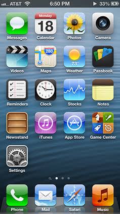
Skeuomorphism was the buzz in the 90s and early 2000s, and was employed in early operating systems and some websites to help people become more familiar and comfortable with virtual interface elements. Best example? iOS 1-6. As seen in the photo above, the icons all mimic real-life objects. For example, the Videos app mimic a clapperboard used by directors, while the Newsstand app mimic a bookshelf. Websites would also employ skeuomorphic design elements to simulate real-life scenarios. Example:

Skeuomorphism gave way to the more modern and fresher flat design. Microsoft first implemented this principle (and called it Metro) when they released Windows Phone 7 in 2010.

While we all know Windows Phone's ultimate demise, Microsoft's design philosophy trickled down to Windows 8 in 2012, thereafter killing the Start menu in lieu of a new Start screen.
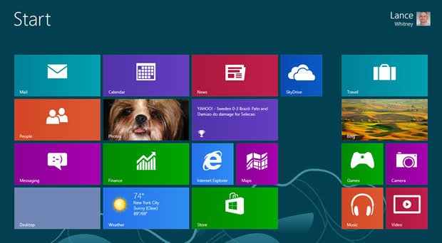
While people didn't like the Start screen, its design principles soon trickled down to pretty much everything else that's going on the Internet right now - websites, OS interface elements, among others. In fact, it's Warrior Forum's design principle.

Skeuomorphism, in its strictest sense, is "the preservation in new products of non-functional features from previous generations" (Coyne, 1995, p. 283). Hence in interface design, it is any interface object which mimic real-world counterparts. Best example of this is the pre-iOS 7 design.
Skeuomorphism was the buzz in the 90s and early 2000s, and was employed in early operating systems and some websites to help people become more familiar and comfortable with virtual interface elements. Best example? iOS 1-6. As seen in the photo above, the icons all mimic real-life objects. For example, the Videos app mimic a clapperboard used by directors, while the Newsstand app mimic a bookshelf. Websites would also employ skeuomorphic design elements to simulate real-life scenarios. Example:
Skeuomorphism gave way to the more modern and fresher flat design. Microsoft first implemented this principle (and called it Metro) when they released Windows Phone 7 in 2010.
While we all know Windows Phone's ultimate demise, Microsoft's design philosophy trickled down to Windows 8 in 2012, thereafter killing the Start menu in lieu of a new Start screen.
While people didn't like the Start screen, its design principles soon trickled down to pretty much everything else that's going on the Internet right now - websites, OS interface elements, among others. In fact, it's Warrior Forum's design principle.
-
byom -
Thanks - Reply
{{ DiscussionBoard.errors[11562377].message }} -