White space and design

by WF- Enzo Administrator
6 replies
  • WEB DESIGN
  • |
Yeah, content is king. It's always the M.O. of every designer, of every content writer, of basically everyone. And I know each marketer wants to cram every bit of information into that 800 x 800 Instagram post. For the right reasons of course.

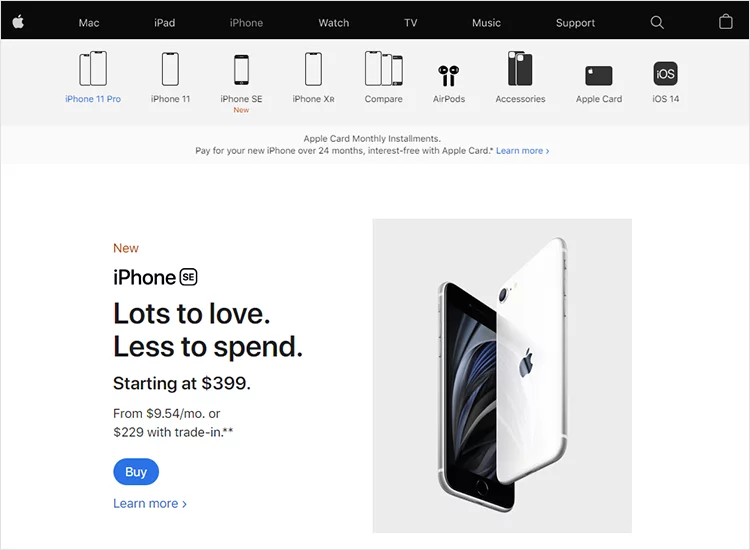
However, these "cram people" forget to realise the importance of white space. It makes designs look and feel more sophisticated. It also gives users the sense that what they're reading is more digestible. According to NNG, white space design improves the readability and scannability of websites.


Image source: Just In Mind

So you see, successful brands such as Apple and Microsoft all implement white space in their design language. That white space applies everywhere - websites, apps, print media, digital ads, etc.


Chime in.
#design #space #white
Avatar of Unregistered
  • Profile picture of the author MicroHard
    I really like white space
    {{ DiscussionBoard.errors[11629254].message }}
  • Profile picture of the author Naheed
    Hi,
    Very nice idea! I also leave white space in design and content.
    White space is soothing on one hand and spreads the idea of clarity on the other.
    Thanks

    Regards
    {{ DiscussionBoard.errors[11629298].message }}
  • Profile picture of the author Matthew Stanley
    From my experience in corporate America, can attest that this concept is also oddly applicable to Powerpoint slides geared towards a (highly analytical) finance audience. Presenting information on charts/slides "as simply as possible - but no simpler", leaving lots of white space, almost always led to the most well-received presentations
    {{ DiscussionBoard.errors[11629354].message }}
  • Profile picture of the author BryanOnline
    White space is a thing, yes... but you also have font and font size. You have colors in general, do they blend or contrast? What about the angle of everything, some times it may draw more attention with a twist. (Forget about the pics)

    If you go big, you may have white space between and/or in the text or image. Personally I think now adays people appreciate the less is more method.

    Make a point and tell them where to go to form more info or where to buy. People need a call to action. Make it BIG for attention and then small for the real info. If they want more, they will go. Once they are there, make it easy to read or buy!
    Signature
    Learn To Earn From The Best...
    "Trust Chuck", I Did..!
    www.MyAffiliateMarketingMentor.com
    {{ DiscussionBoard.errors[11629534].message }}
  • White background with black font, always great to increase readability and avoid hurting customer's eyes
    {{ DiscussionBoard.errors[11629614].message }}
  • Profile picture of the author King Manu
    White space is great at focusing ideas and delivering powerful messages! Copywriting is powerful when you combine it with a minimalist design.
    {{ DiscussionBoard.errors[11629632].message }}
Avatar of Unregistered

Trending Topics